Led end-to-end design of EmotiBit’s public-facing experience — including product narrative, website, visual identity, and data interface.
EmotiBit
From complex biosignals to clear, credible, and approachable experiences.
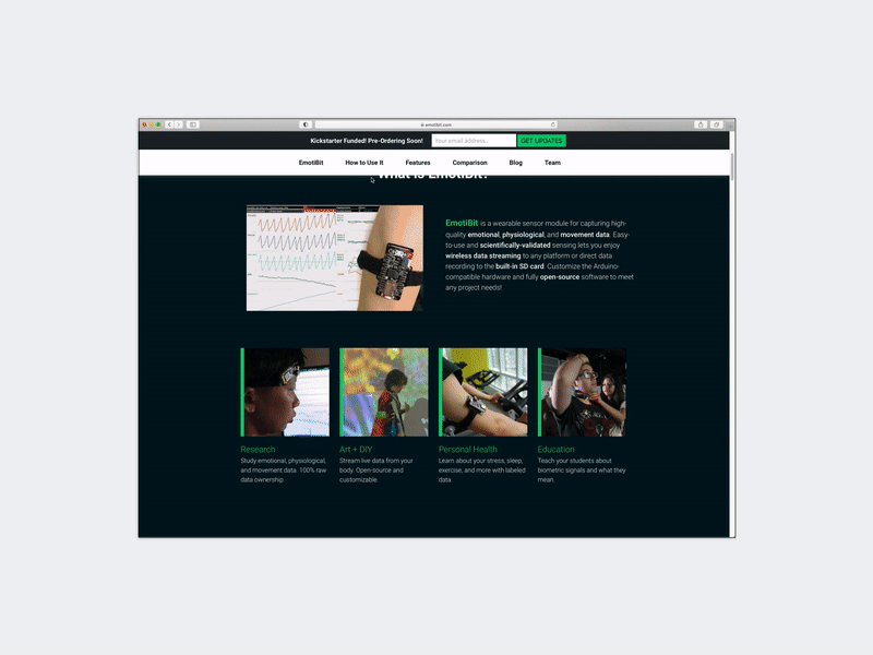
EmotiBit is an open-source wearable platform, developed by Connected Future Lab, that captures real-time physiological signals — but raw biosignal data alone is not meaningful to most users. The core challenge was translating complex sensing into something people can understand, trust, and use.
I led the design of the public-facing experience across the website, interface, and launch materials — shaping how the product communicates its capabilities while preserving scientific credibility.
The work centered on how to turn a complex sensing product into a clearer decision-making journey, from first understanding the device to deciding whether it fit a user’s workflow.
Press: Techacute, Hackaday, OpenBCI, Science Direct
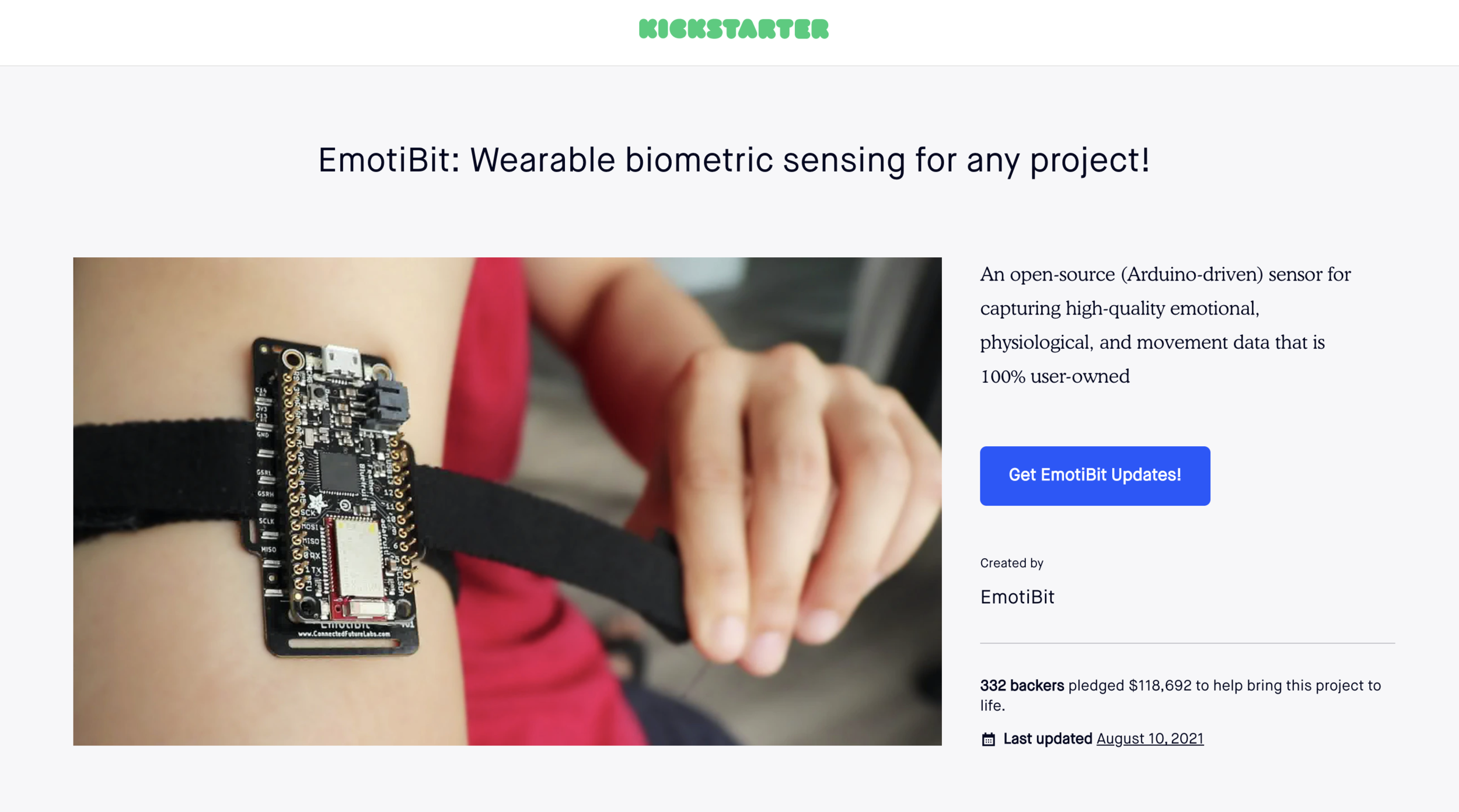
Kickstarter page: kickstarter-emotibit
Cross company collaboration: NYU, Open BCI
750% funded Kickstarter campaign, with 2000+ subscribers.
Problem
Biosensing products sit at the intersection of hardware, data, wellness, and research — making the user experience difficult by default. Too much technical detail alienates new users, while oversimplification weakens trust. Most tools either expose raw data without context or simplify insights at the cost of credibility. Users struggle to interpret signals, trust the data, and connect it to real-world use.
This creates a “last mile” problem: users may be intrigued by the hardware, but still don’t understand what the product does or how it fits into their workflow. For EmotiBit, the challenge was to make complex biosensing both credible and accessible — bridging the gap between technical depth and everyday usability.
Approach
The design focused on translating complex biosensing into a clear and credible product experience. Rather than simplifying the technology, I structured the experience as a decision-making journey — helping users move from understanding what the device measures to deciding how it fits into their workflow. The approach centered on four key moves:
Research and positioning
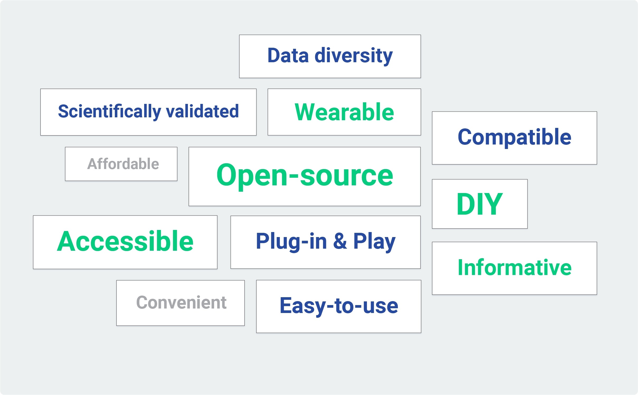
I clarified EmotiBit’s positioning across three dimensions: what data it captures, what users can do with it, and how it differentiates from adjacent wearables. This revealed a key tension — making complex biosensing accessible without losing scientific credibility — which guided the design decisions that followed.
01
Value Proposition
Synthesized feedback from 48 alpha users to identify key product values — revealing the need to balance accessibility with scientific credibility.
02
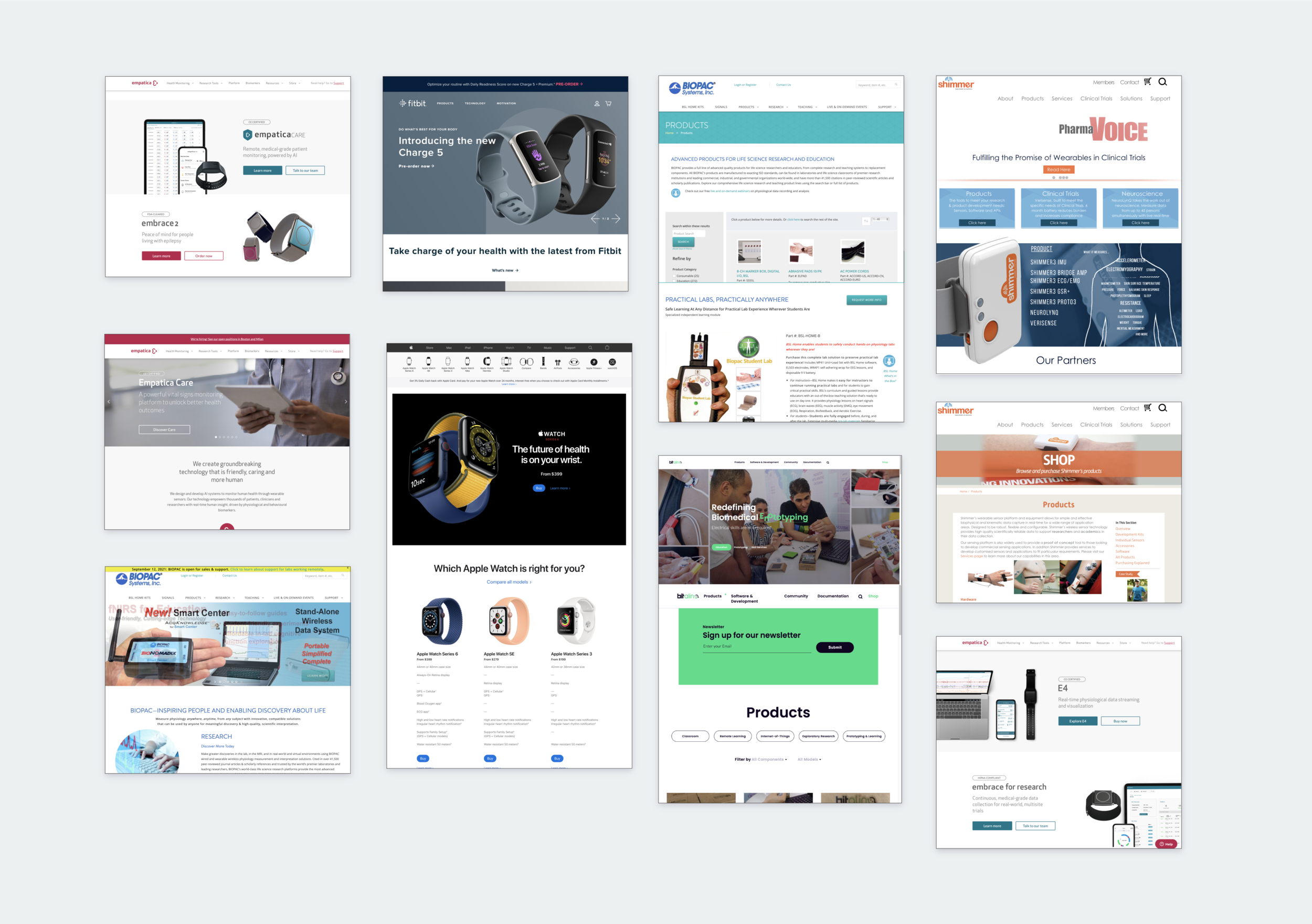
Competitor Analysis
Most competitors prioritize either consumer simplicity or technical depth — rarely both. This gap defined EmotiBit’s positioning as a bridge between accessibility and rigor.
03
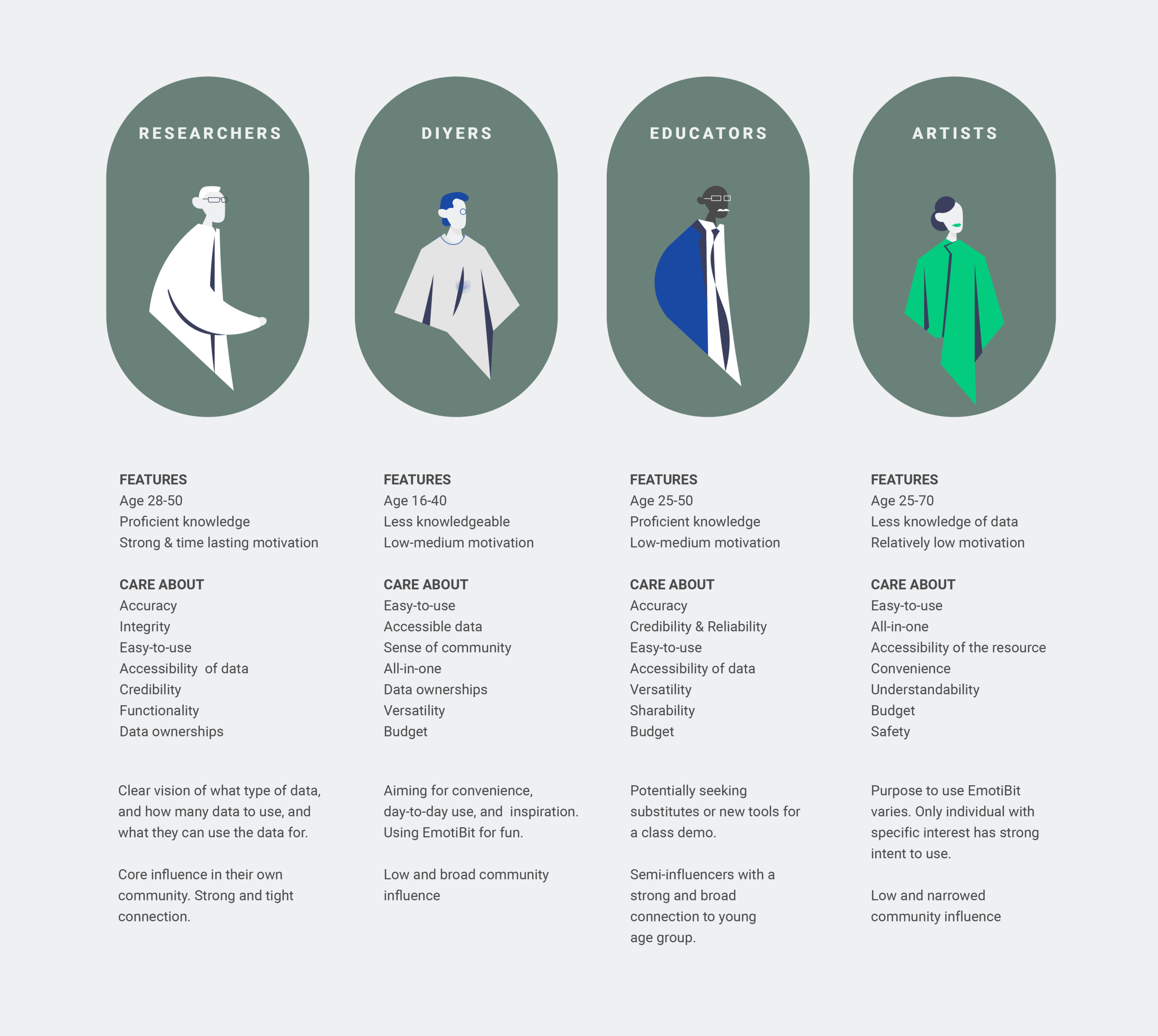
Target Users
Defined four user groups with varying levels of expertise, helping balance technical depth with accessibility across different entry points.
Information architecture for understanding
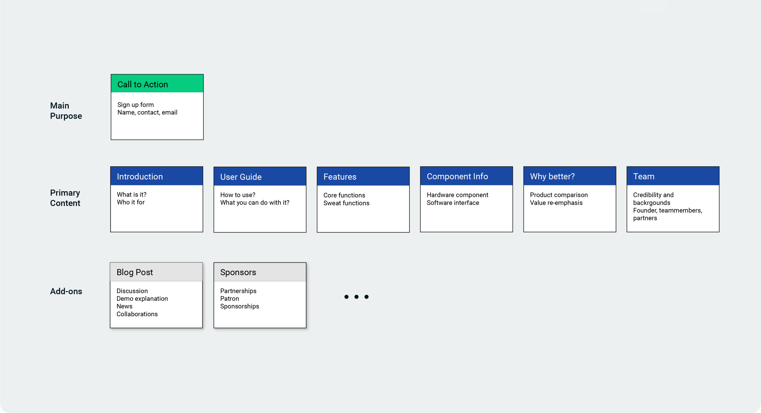
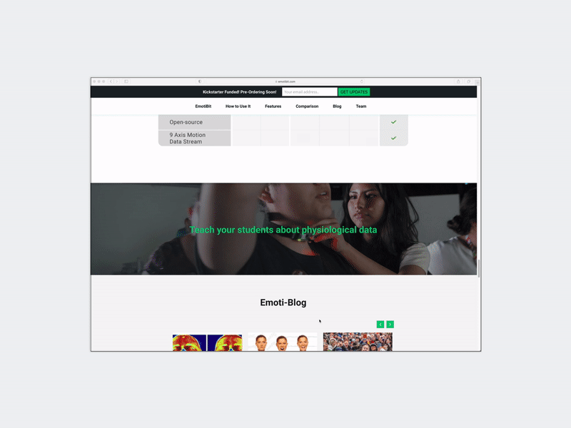
To translate the product strategy into a clear user experience, I designed a structured information architecture — defining how content is organized, prioritized, and revealed.
01
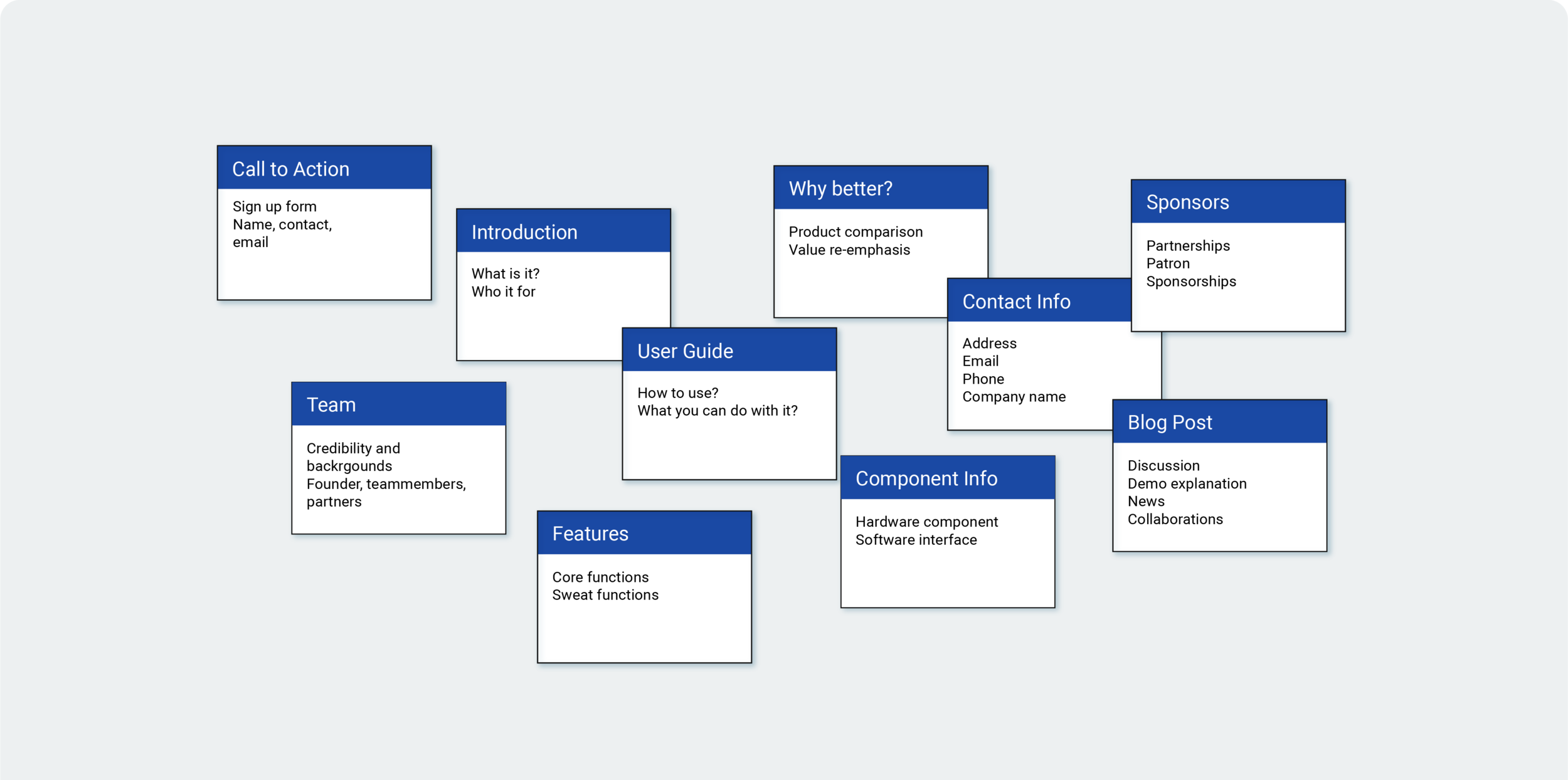
Structuring the Content System
To make complex information easier to navigate, I broke the website into modular content blocks that could be rearranged and tested without breaking the overall narrative.
02
Defining Information Hierarchy
Content was organized from core understanding to deeper supporting detail, helping users grasp the product quickly before diving into technical complexity.
03
From Structure to Layout
The modular model enabled a flexible one-page layout where sections could shift by priority while preserving a continuous end-to-end narrative.
04
Iteration & Refinement
Through user feedback and testing, the structure was refined to better support clarity and decision-making across the full one-page flow.
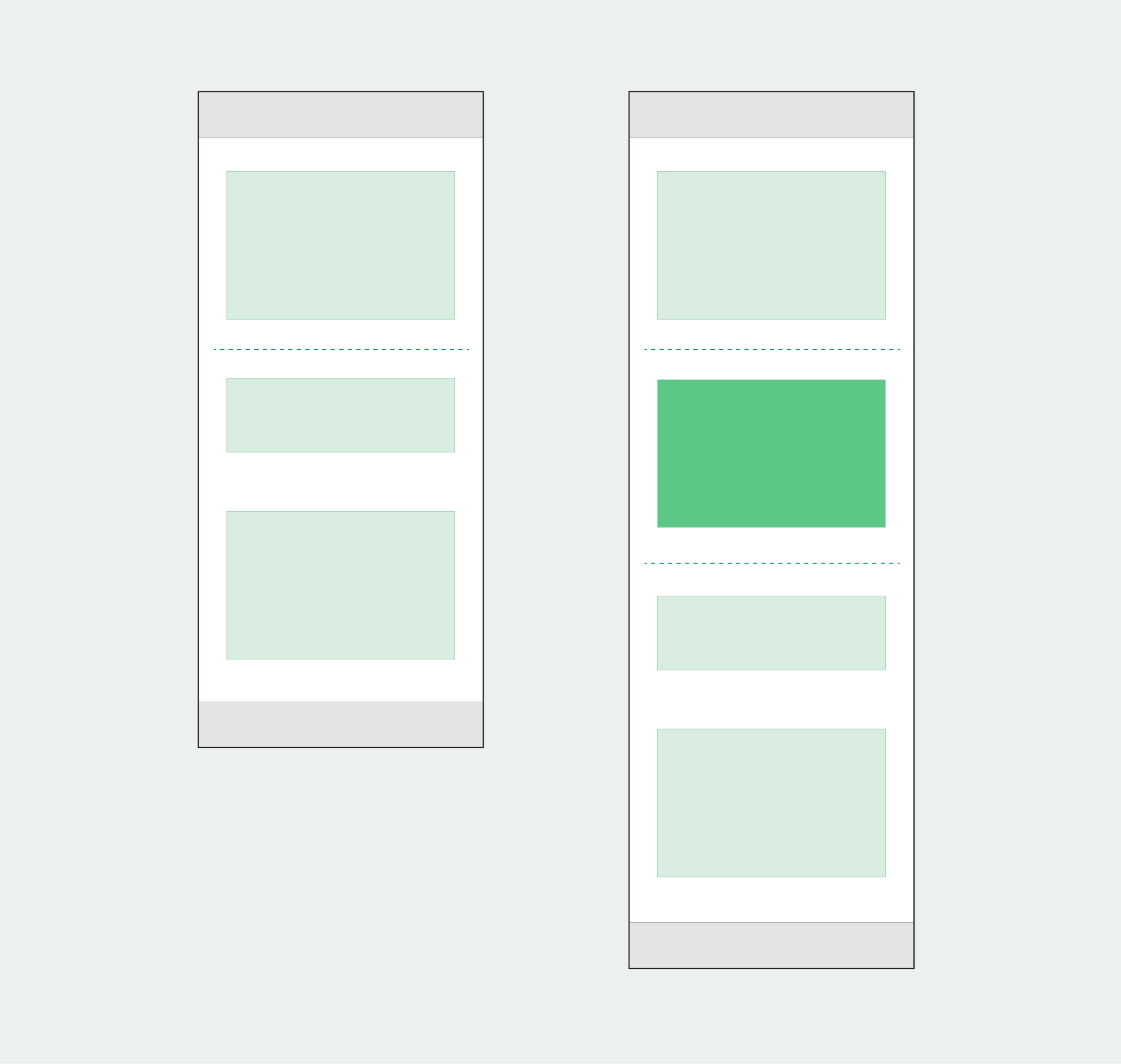
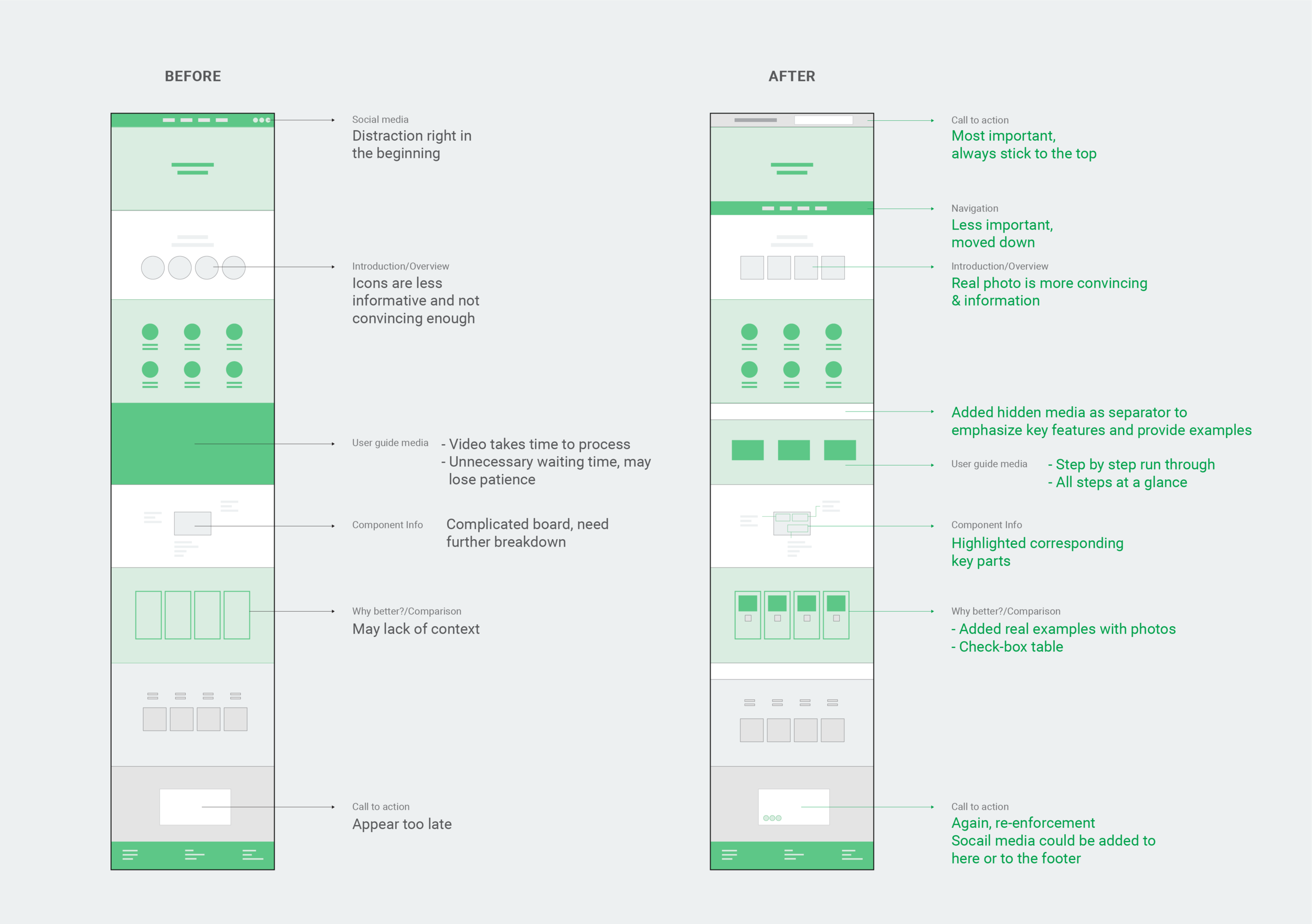
Interaction & Visual System: Guiding Users from Overview to Understanding
To translate complex biosensing into a usable experience, I designed interaction patterns and a visual system that work together to guide users from high-level understanding to detailed exploration—without overwhelming them. These interaction and visual decisions reinforce the underlying information architecture—ensuring users can move seamlessly from overview to detailed understanding.
01
Navigation & Hierarchy
• Persistent navigation keeps users oriented in a long-form page
• Typography and spacing create clear entry points into dense content
• Section dividers break information into digestible steps
02
Content Rhythm & Scanning
• Visual rhythm alternates between dense information and breathing space
• Section separators reinforce structure and reduce cognitive load
• Repetition of key messages improves retention
03
Progressive Disclosure
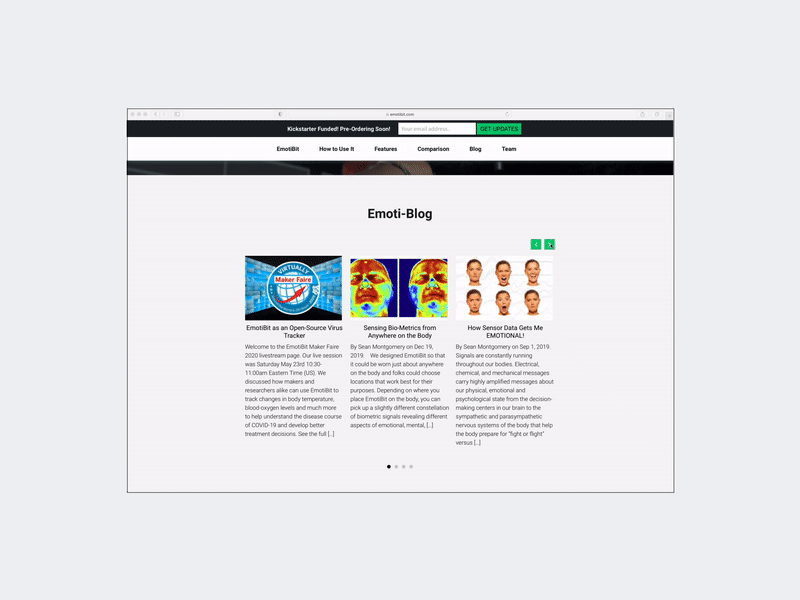
• Carousels allow users to explore deeper content without leaving context
• Revealing info progressively to support both scanning and deep reading
• Supports different user types (quick scan vs detailed exploration)
04
Calls to Action
• Primary actions are consistently highlighted using accent color
• CTAs remain visible without disrupting content flow
• Reinforced at key decision points rather than competing for attention
Extending the System to the Data Interface
The principles developed for the website—clarity, hierarchy, and progressive understanding—were extended to EmotiBit’s data interface to make real-time biosignal data more legible and usable.
01
The Challenge
The original interface exposed raw biosignal streams with minimal structure, making it difficult to interpret relationships between signals or extract meaningful insights.
02
Design Approach
Due to technical and time constraints, the redesign was limited to adjustments in color, typography, and layout—requiring the solution to rely on visual clarity rather than structural changes.
03
Visual Hierarchy for Data
Introduced consistent color mapping across signal types Increased contrast to distinguish overlapping data streams Organized charts into clearer groupings.
04
Readability Under Density
Simplified visual noise to reduce cognitive overload. Adjusted typography and spacing for faster scanning Reduced ambiguity between signals
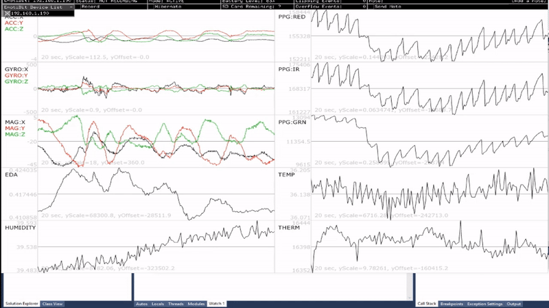
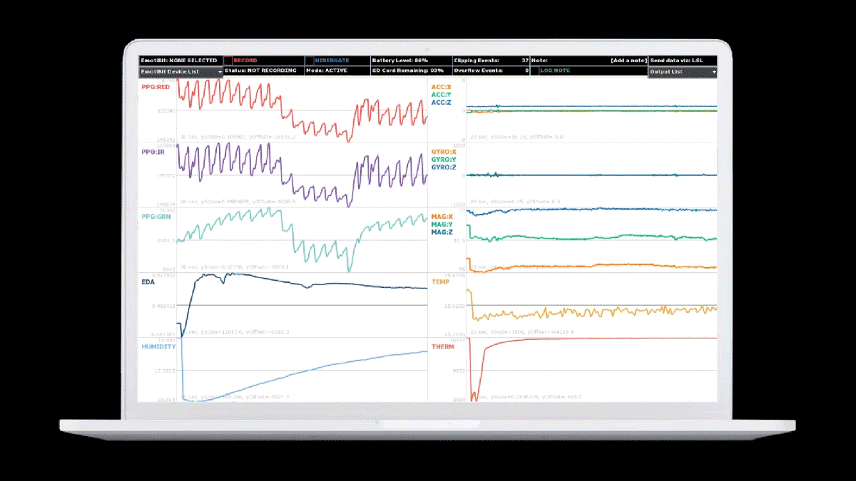
Consistency with Product System
Applied the same color logic used in the website. Reinforced a unified visual language across product surfaces. Improved continuity between learning (website) and usage (interface). The redesign improved readability of complex biosignal data, allowing users to more easily compare signals and interpret patterns in real time—bridging the gap between raw data and actionable understanding.
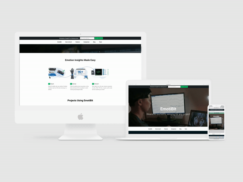
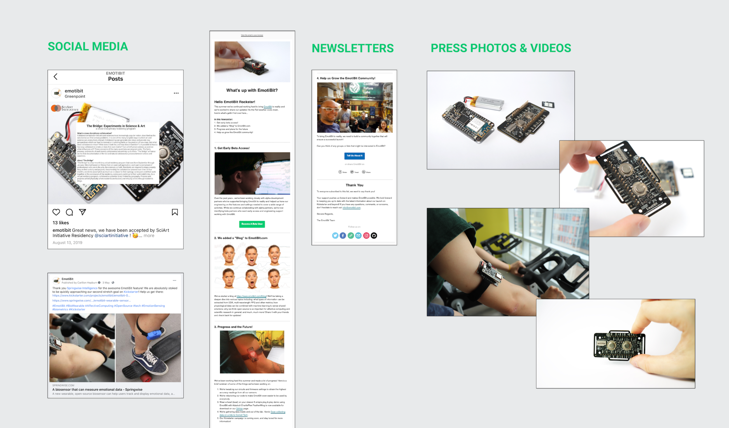
Launch and product communication
The work extended beyond the website to shape a coherent product-facing system across branding, communication, and launch materials—ensuring the product felt both scientifically credible and accessible to new audiences.
01
Brand System
Refined visual identity to align with product positioning. Explored logo directions before converging on a system that feels technical yet approachable.
02
Launch & Communication Assets
Designed launch site, social media, and press materials. Ensured consistent messaging across all touchpoints. Translated technical capabilities into clear, audience-specific narratives.
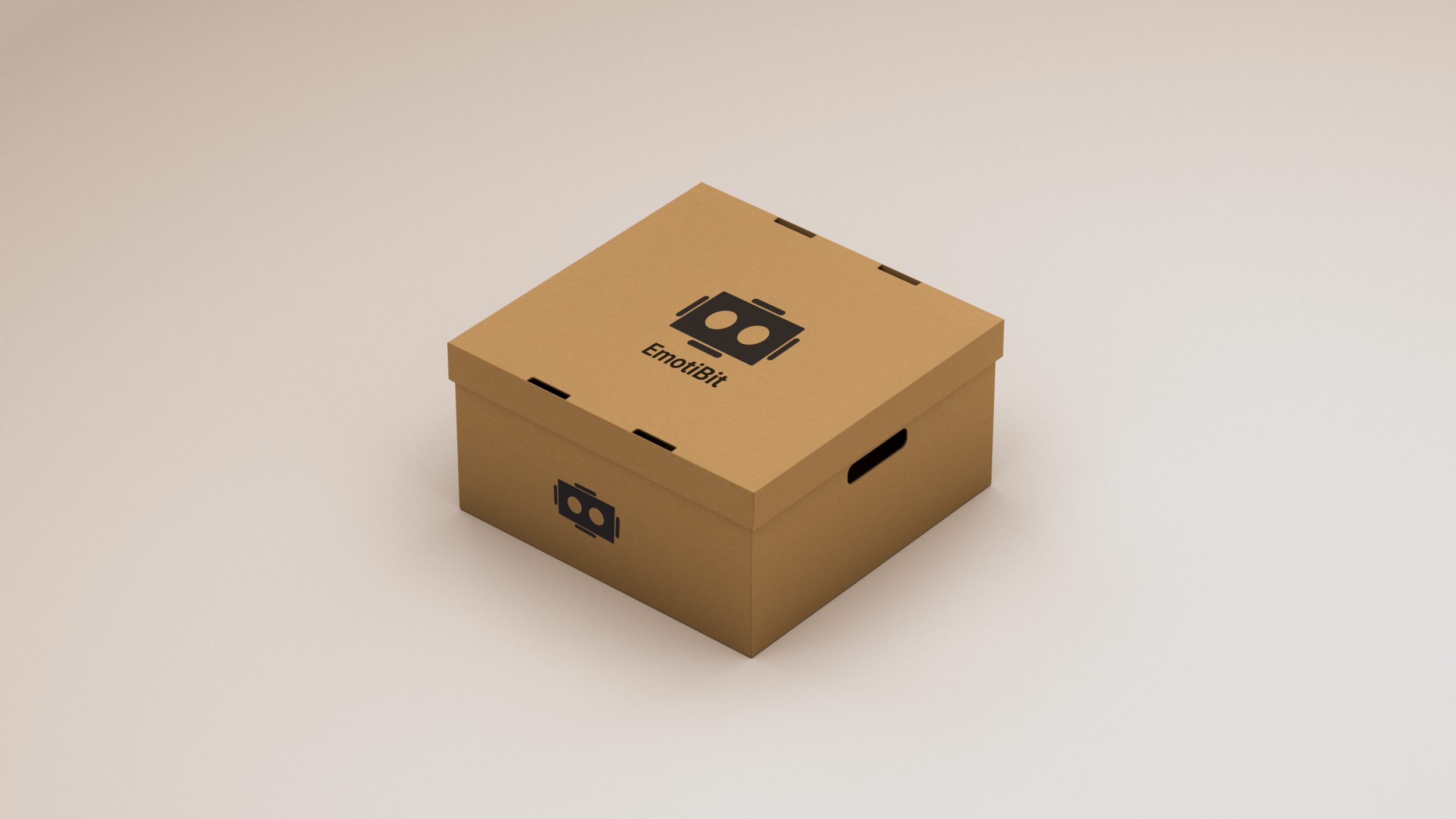
03
Physical & Product Touchpoints
Packaging and merchandise extended the identity into tangible experiences. Reinforced brand recognition beyond the digital product.
Impact and Output
01
Product
The redesign established a coherent product-facing system for EmotiBit—clarifying its value, improving information legibility, and aligning the experience from first impression to real-world use.
02
Fundraising
The launch contributed to over 1,000 subscribers and funding that reached approximately 750% of the original target—indicating that a clearer product narrative directly improved audience understanding and engagement.
03
Outlook
This project shaped my approach to designing systems that translate complex technologies into accessible experiences—ensuring clarity is not only communicated, but consistently experienced across interfaces, platforms, and contexts.
Next project