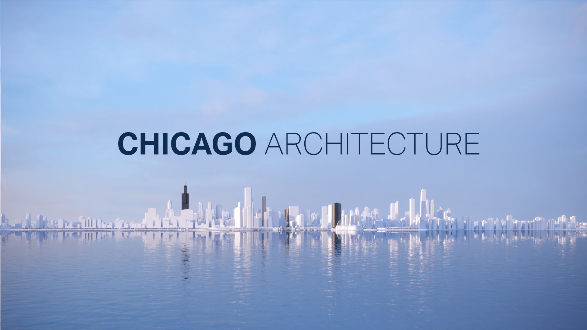
Chicago Architecture at Chicago Skydeck
A CGI tour and large-scale motion graphic experience for the highest observation deck in the United States — tracing Chicago’s skyline through seven iconic buildings, each given a graphic identity rooted in the elemental force behind its design.

Chicago Architecture — part of the immersive reopening of Chicago Skydeck at Willis Tower.
When the highest observation deck in the US reopened, it transformed from a lookout point into a museum-quality exhibition space. The Chicago Architecture film was designed to orient visitors to the skyline they had just ascended into — using motion graphics, 3D animation, and VFX to tell the story of each building visible from the Ledge.
My role was to design the graphic system that lived inside this film: defining a visual identity for each of seven landmark buildings, building a hierarchy of animated graphic elements, and creating the style frames that guided the final CGI production. Each building received its own elemental symbol — drawn from the architectural intent of its designers and translated into a language that reads at scale on a large-format screen.
The project ran from July through December 2020 at Squint/Opera, in collaboration with exhibition designers Thinc Design and sound designers Codato Codaldn.
The Film
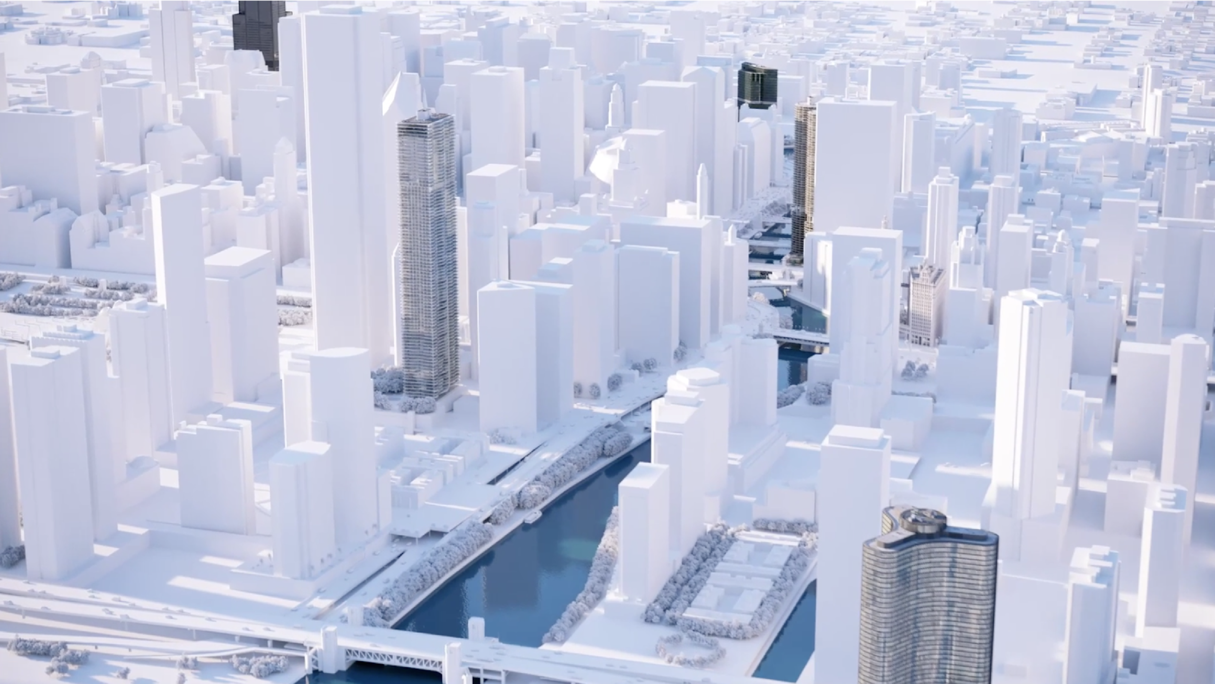
The Chicago Architecture experience is a CGI tour of the city known for its skyline — ending at Willis Tower, the building visitors are standing inside. Motion graphics, 3D animation, and VFX create an immersive, large-scale media experience that reads as cinema while delivering architectural history at a public pace.
Seven buildings are featured, each allocated its own chapter in the sequence. The film moves from ground level through the city, building momentum toward the final reveal: the structure of Willis Tower itself, framed from the inside out.


Style frames overview showing the graphic identity system applied across all seven buildings.
Research & Visual References
The design process began with architectural research — understanding not just what each building looks like, but what it stands for. Each Chicago landmark was built with a specific material logic, structural innovation, or cultural aspiration. That intent became the brief for each building’s graphic identity.
Visual references were gathered across architectural photography, material studies, and historical drawings to identify the graphic vocabulary that would translate each building’s essence into animated form.


Research phase — architectural references mapping the material and structural logic behind each landmark’s design.
Elemental Narrative System
Each building was assigned an elemental identity — a single natural force or material that captures why the building looks the way it does. These identities became the design brief for each building’s graphic chapter: they dictated color, motion language, shape grammar, and hierarchy.


Elemental identity system: Wind (Lake Point Tower), Rock (Aqua), Stone (Tribune), Flora (Marina City), Glass (333 West Wacker), Steel (Willis Tower).
Graphics Hierarchy
With seven buildings each carrying distinct visual identities, a shared hierarchy was essential for legibility across the film. The hierarchy defined which graphic elements animate first, how they sequence, and how foreground identity graphics relate to the 3D background environment — ensuring the film reads as a unified experience rather than seven separate segments.


The graphics hierarchy document — establishing how identity elements, data graphics, and typographic layers animate and stack within each building chapter.
Style Frames — Introduction
The introduction sequence establishes the visual language of the film before the building chapters begin. It sets the tone for the color palette, motion grammar, and typographic system that will carry through to each landmark — orienting the visitor to Chicago at scale before descending into the architecture.


Introduction style frames — establishing the city-wide perspective and graphic language before the tour begins.
Lake Point Tower — Wind
Lake Point Tower’s distinctive curved form was engineered to withstand Chicago’s notorious winds — the city’s nickname, "The Windy City," is both meteorological and political, but this building takes the physical fact seriously. The building’s three-lobed cloverleaf plan reduces wind resistance at the structure’s corners, making its shape a direct solution to atmospheric force.
The Wind identity translates this into graphic language: flowing directional lines, dynamic motion blur, and a palette that reads like air in motion over Lake Michigan.


Lake Point Tower — Wind. Graphic identity frames for a building shaped by the forces it was built to resist.
Aqua Tower — Rock
Aqua Tower’s undulating balconies were inspired by the contour lines of limestone rock formations found throughout the Great Lakes region. Architect Jeanne Gang drew directly from local geological forms, giving the building a topographical quality — the facade reads like a cliff face or a striated outcrop when viewed from the right angle.
The Rock identity works with sedimentary texture, layer accumulation, and horizontal strata as its primary graphic motifs.


Aqua Tower — Rock. The undulating contour graphics mirror the limestone formations that inspired Jeanne Gang’s facade design.
Tribune Tower — Stone
Tribune Tower’s base is studded with 147 stones and fragments embedded into the facade — collected from significant buildings and sites around the world by Tribune correspondents at the instruction of Colonel Robert McCormick. The Parthenon, the Great Wall, the Berlin Wall, the Moon. The building is a physical archive of material history.
The Stone identity draws from this idea of collection: assembled fragments, mosaic structures, and the visual weight of accumulated material.


Tribune Tower — Stone. The collected-fragments motif references the building’s embedded archive of material from monuments around the world.
Marina City Towers — Flora
Marina City’s circular towers, with their distinctive flower-petal balconies stacked in a spiral pattern, were designed to be a "city within a city" — a place where residents could live, work, and play without leaving the complex. Architect Bertrand Goldberg drew on organic forms, giving the towers a biological character that stands in contrast to Chicago’s predominantly rectilinear skyline.
The Flora identity captures this organic quality: petal forms, radial geometry, and growth patterns that echo the building’s distinctive profile.


Marina City — Flora. Radial petal forms echo the building’s circular floor plates and Goldberg’s organic design philosophy.
333 West Wacker — Glass
333 West Wacker sits at the bend of the Chicago River where it meets Wacker Drive, and its curved green-glass facade was designed specifically to mirror the curve of the riverbank. On clear days the reflection of the water and the sky produces an almost perfect trompe-l’oeil — the building becomes the river, and the river becomes the building.
The Glass identity works with reflection, transparency, and refraction: layered translucencies, gradient specular effects, and shifting color fields that change as the viewpoint moves.


333 West Wacker — Glass. The reflective palette mirrors the building’s role as a surface for sky and river, not a barrier to them.
Willis Tower — Steel
Willis Tower closes the film. Designed by Bruce Graham and structural engineer Fazlur Rahman Khan of SOM, the building introduced the bundled tube structural system — nine square tubes of varying heights grouped together to form a single tower. The structure is honest: the tubes are visible in the silhouette, and the building’s form is entirely legible as an expression of how it stands.
The Steel identity works with structural geometry, orthogonal grids, and the tension between load and span. The graphic language is precise, angular, and built — a fitting conclusion for a film seen from inside the building itself.


Willis Tower — Steel. The building that visitors are standing inside, revealed last — its structural logic made graphic and legible at scale.
In the Exhibition
The Chicago Architecture film was installed as part of the broader Skydeck reopening — a museum-quality experience designed by Thinc Design, with digital media produced at Squint/Opera. The large-format screens sit alongside the physical Ledge glass boxes, creating a sequence that moves visitors between the graphic abstraction of the film and the direct, unmediated view of the city from 103 floors up.


Chicago Architecture in the Skydeck exhibition space. Photo credits: Andy Fritsch.
Outcome
The Chicago Architecture graphic system gave the film a coherent visual logic that scaled from thumbnail research sketches to full-bleed large-format display. By grounding each building’s identity in a single elemental force — rather than in surface aesthetics — the system ensured that visitors who had never heard of Lake Point Tower or Tribune Tower could nonetheless understand, immediately, what made each building distinct.
The exhibit became part of the permanent Skydeck experience upon opening, seen by visitors at the highest observation deck in the United States.
Next project